Case study, Cornerstone Pilates
A new studio needed first-time visitors to book, not just browse.
Cornerstone Pilates is a community reformer Pilates studio in Jersey City. I lead its brand and creative direction: I designed the identity, then built and launched the site, from the wordmark to the page where someone books a class.
Full disclosure: I helped my wife found the studio. She owns it and runs it day to day; I lead the brand and marketing alongside my day job. I'd rather say that upfront and let the work speak.
The 30-second version
Problem
A brand-new studio needed an identity and a site that felt calm and welcoming, and that turned a first-time visitor into a booked class.
What I did
Designed the identity and visual language, built the site in Squarespace with scheduling and memberships through Arketa, and set up a brand kit the whole team uses.
What happened
Booking, pricing, classes, and policies each sit one click from the home page. The studio now has 150+ active clients and runs 56 classes a week.
- My role
- Brand and creative director. I designed the identity and built the site myself.
- Worked with
- The studio team, plus a social media manager I direct
- Tools
- Adobe Creative Cloud, Squarespace, Arketa
- Context
- Jersey City, opened in spring 2026. Live at cornerstonepilatesjc.com
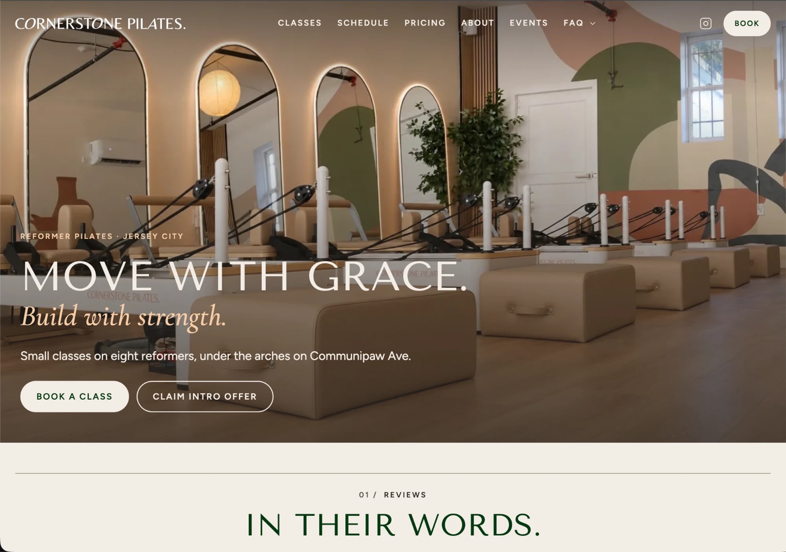
The problem
The studio wanted to feel calm and welcoming rather than performance-driven, especially to people who had never tried reformer Pilates.
It was also brand new, so the site had one job above all: get a first-time visitor to book.
The constraint
One designer, from the wordmark to the live site.
What I noticed
I hear from clients and the studio team constantly, and the site and brand have changed because of it.
The thing I hear most is about the feel of the brand. One client described it as a warm hug. So we lean into that more, on the site, in the posts, and in the studio itself.
What I decided
- Set the tone first. Warm neutrals, generous space, and quiet type. The studio's line, "move with grace, build with strength," set the tone the whole system had to hold.
- Make the mark its own. The wordmark starts from Freight Neo, with the A and O redrawn.
- Put everything one click away. Booking, pricing, classes, and policies each sit one click from the home page, so a first-time visitor never has to hunt.
- Connect booking to the site. Scheduling and memberships run through Arketa, linked from the Squarespace site.
- Give the team a kit. A color system, type styles, and social templates keep the brand consistent no matter who posts. I still approve everything that goes out.
Tradeoff
We chose not to follow the design trends other Pilates studios follow. Clients tell us that's part of why the studio feels like a community.
Up close: the system in use
Move with grace, build with strength.

The wordmark. Freight Neo, with the A and O redrawn. 
The icon 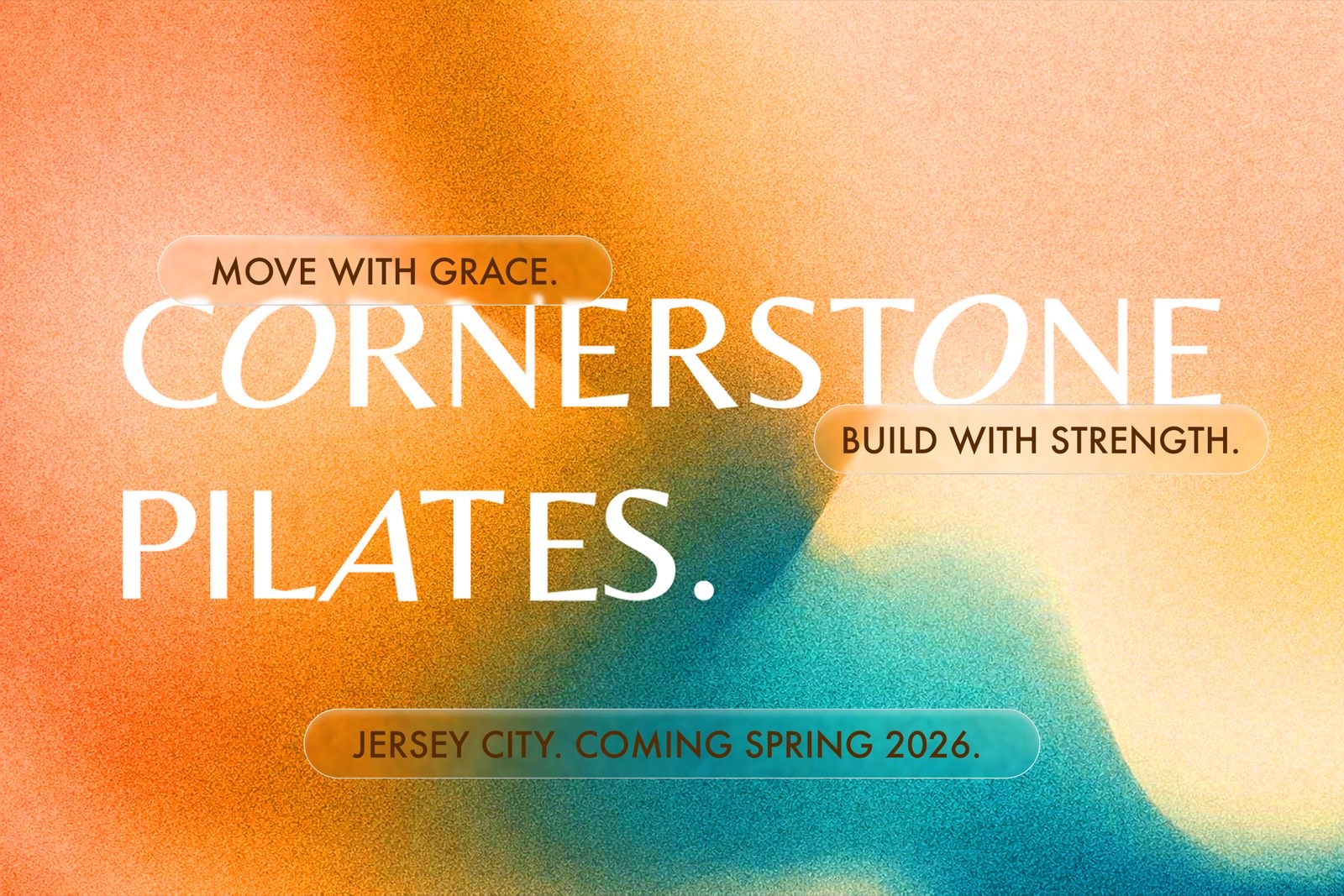
Opening announcement 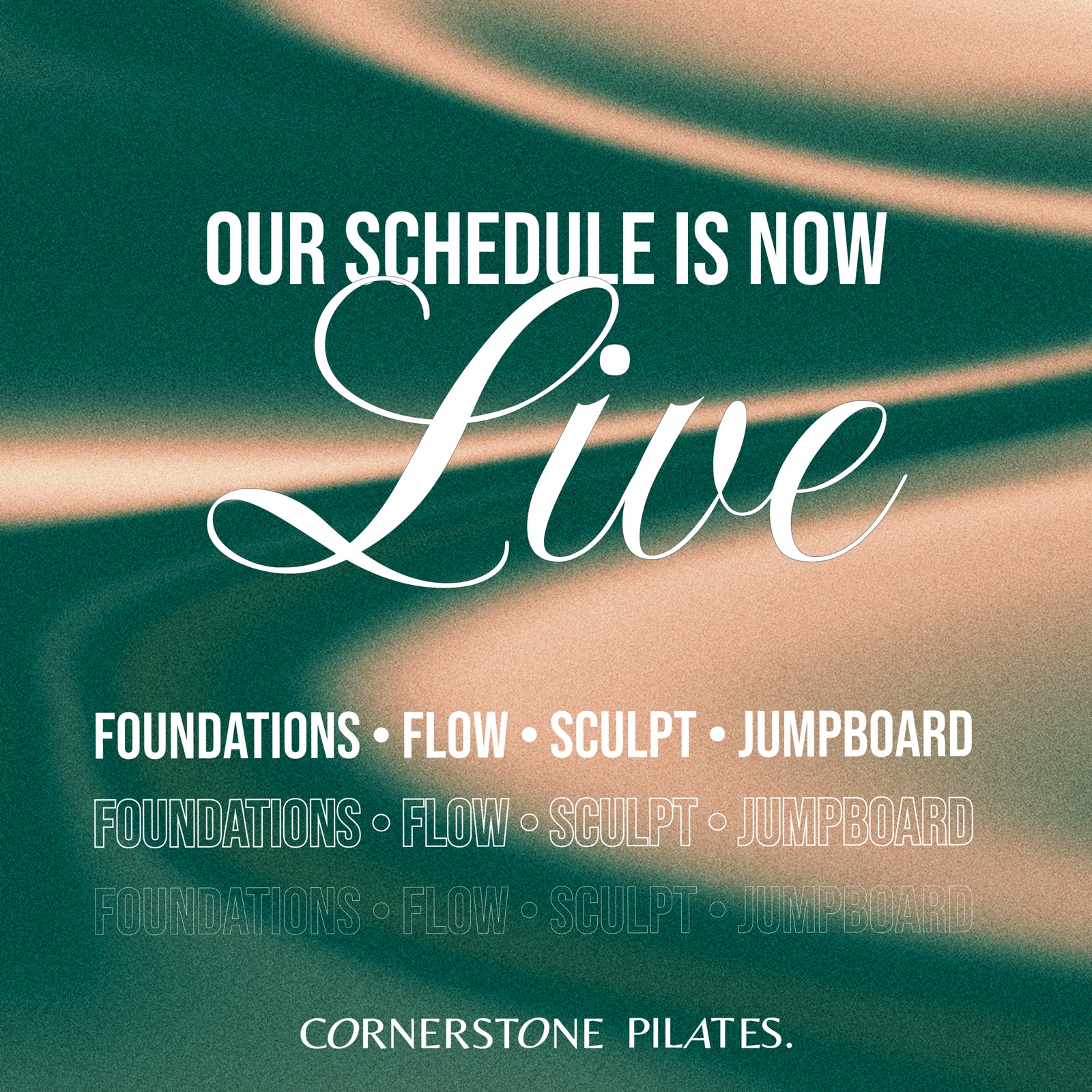
The schedule goes live 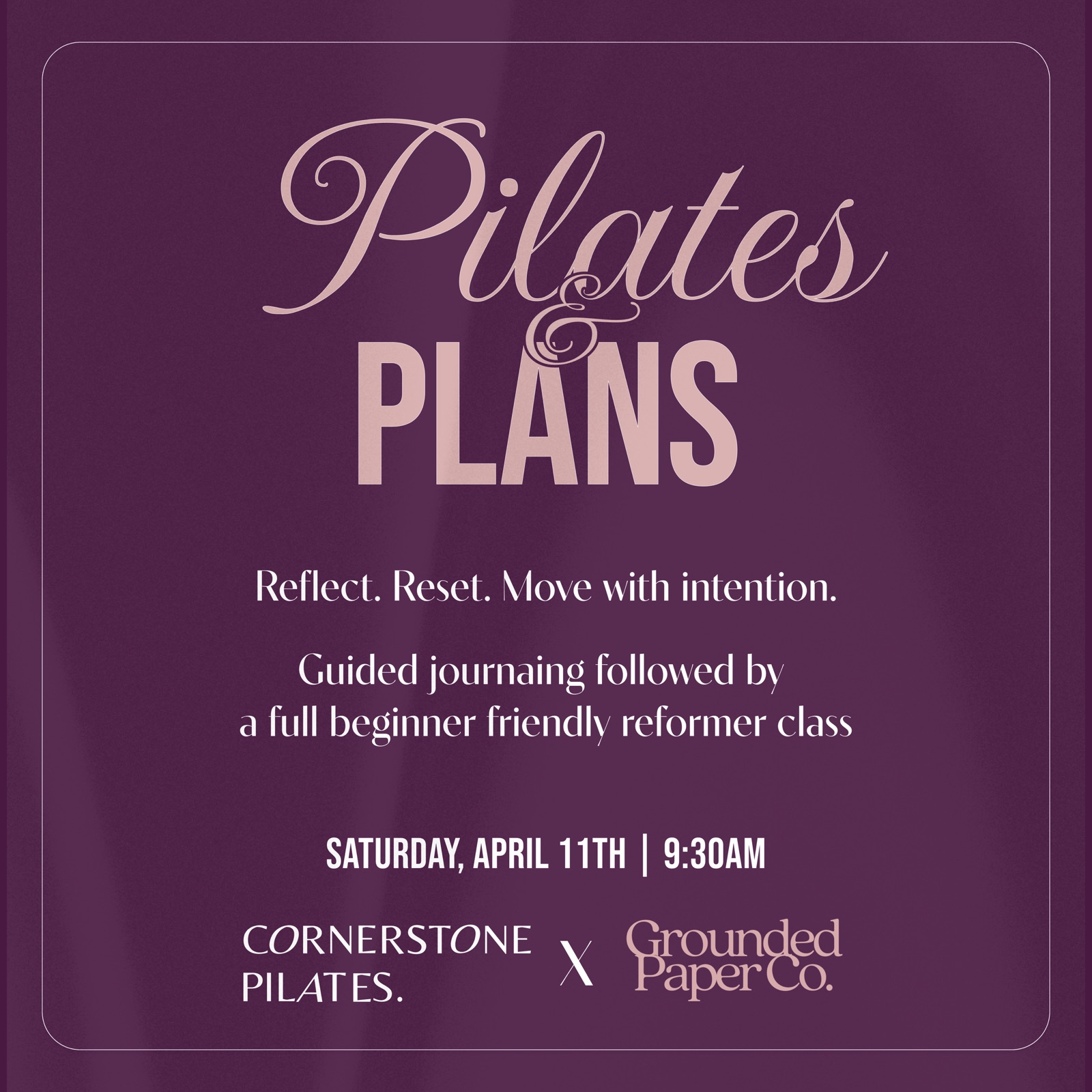
Partner class with Grounded Paper Co. 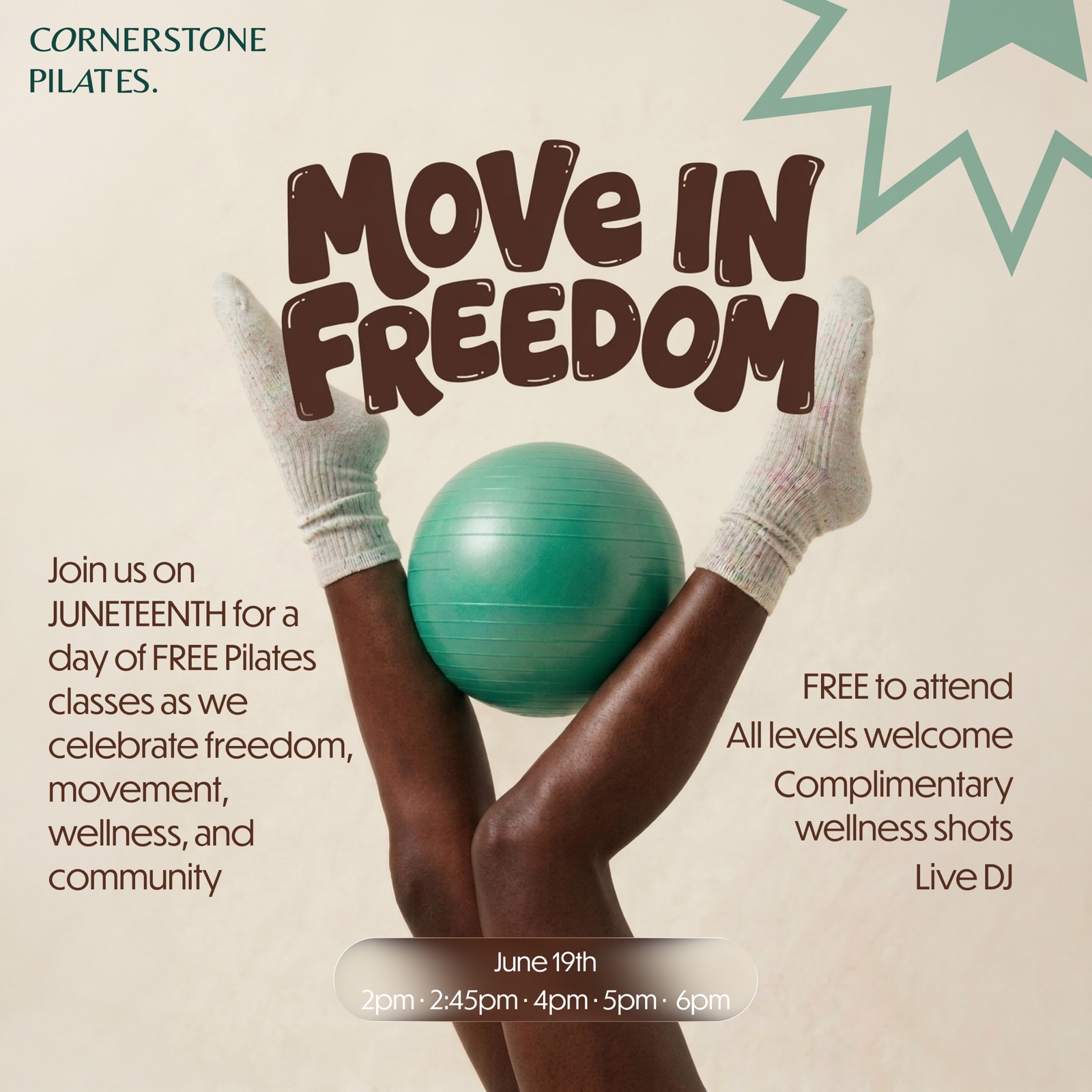
Free community classes on Juneteenth
What happened
A live site at cornerstonepilatesjc.com where booking, pricing, classes, and policies each sit one click from the home page. The studio now has 150+ active clients and runs 56 classes a week.
Why it's here
It's the one project where I own every decision: identity, layout, the build, and what happens after launch.
What I'd change
I'd gamify coming to class. That's the next project: 3D printed milestone pieces, a keychain, a desk stack, a wall plaque, marked with the number of classes someone has taken. It's in progress, renders only so far, and it has its own page.